Level Ground needed to update their web assets. Our goal was to continue to refine the positioning of their brand to stand out from their competitors and bring all components up to current standards.
Challenges
Refine brand position vs. competitors
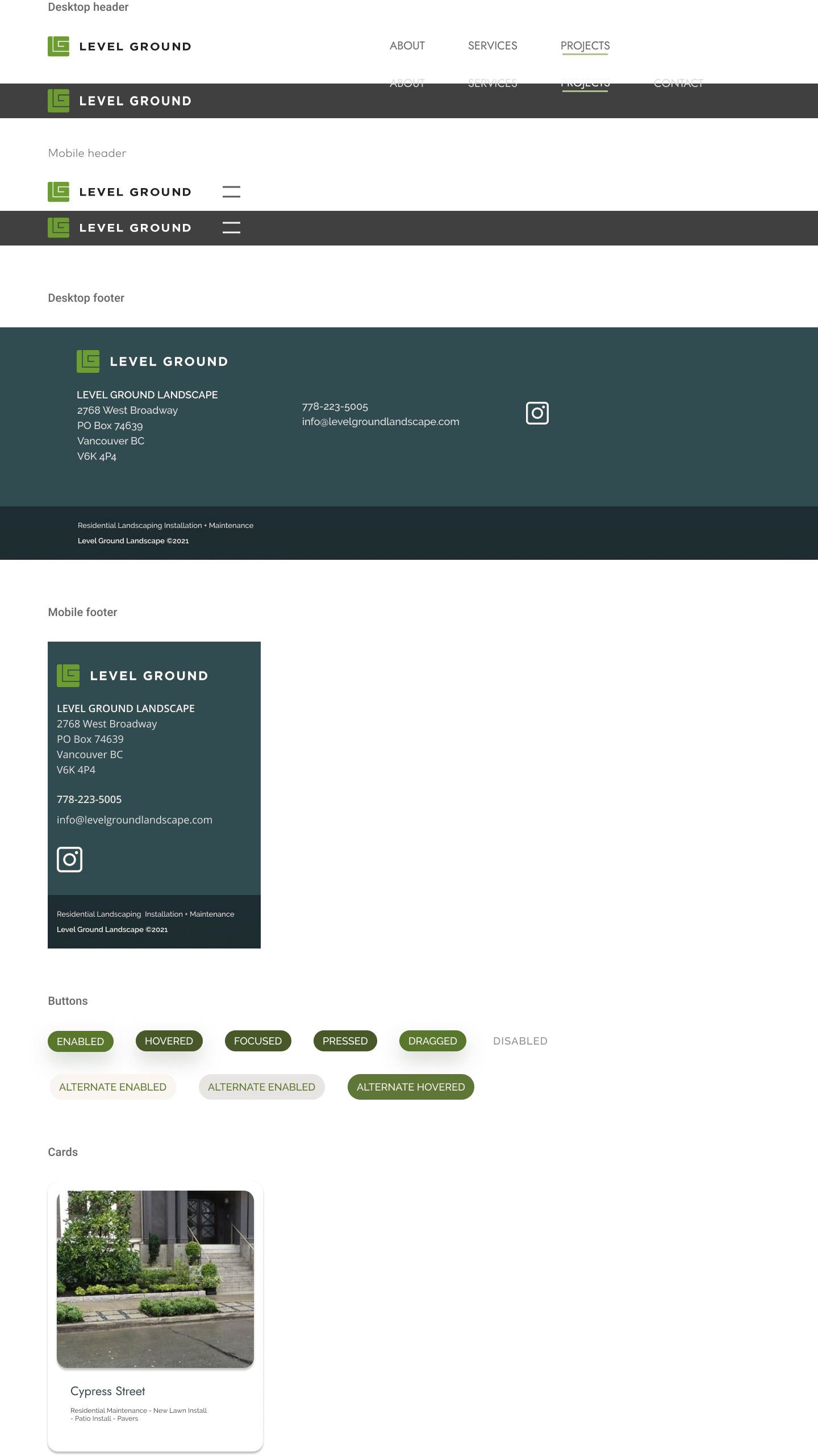
Updated design patterns and refined components for future updates
Determine colors + fonts will speak to their target customer
Refining and simplifying residential customer journey
IMPACT
90 days vs. last year
Users +41%
Pageviews +82%
Pages/Session +31%
Avg. Session Duration +57%
Bounce rate -7%
Organic search impressions +731%
DATE
Aug 2021 – Sep 2021
role
UX Research UX Design WordPress SEO
research
Competitive audit User interviews Personas Journey maps
deliverables
Responsive UI Design system Website templates
Empathize
Determine the interface changes needed to attract the target audience. Understand the elements needed in the user journey to educate, excite and delight the user, resulting with a request for services.
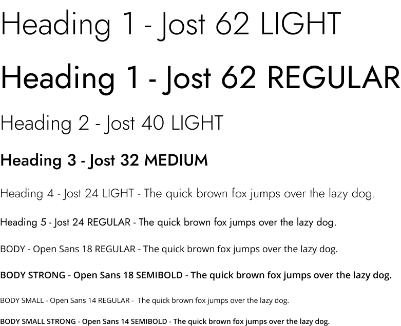
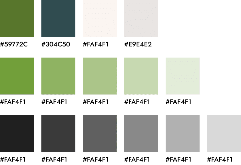
What colours, fonts and page layout will speak more directly to the target audience.
What can we learn from the steps a user takes as they discover the services offered. Is any content missing?
What micro interactions can be added to strengthen the brand.
Anna is a single parent who recently relocated from Shanghai to Vancouver. She works a lot of hours each week and wants to come home to a perfect house and yard. She is concerned about having a healthy environment for her 6 year old.
“As a single parent, I want my back yard to look good, be easy to maintain, as well as be well suited for my child and their friends to play.”
Susan
Age: 52 Education: MBA Hometown: Burnaby Family: lives with partner Occupation: College professor
Susan is a busy professional who is competitive and wants her house to look better than her neighbours. She wants to find a residential landscaping company who can do a new front and back yard installation as well as maintain the property as she is away frequently.
“I want a landscaping company that is aligned with my personal aesthetics, and can both install and maintain my garden as I am very busy between teaching and freelance projects.”
Competitive audit
I compared the user experience of 7 competitors websites.
I see the following opportunities:
user industry standard terminilogy AA/AAA accessibility compliant, simplified navigation on mobile and desktop with subnav
inclusion of projects with images, services and description, highlighted on all pages
add micro interactions
determine a good balance between image and text for the target audience
consistency of colours, fonts, and layout patterns as competition is well designed
focus offerings for residential services as commercial sector is very competitive
Ideate
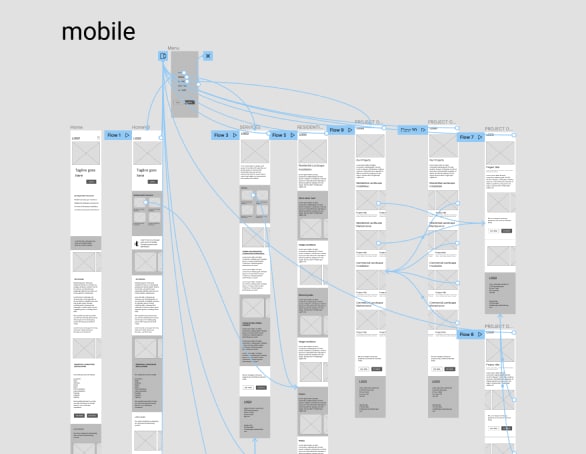
I created a site map, journey maps, paper and low-fi wireframes and used these to help us understand how a new user might travel thru the website, thinking about the interface and interactions with user goals in mind.
Sitemap
Digital wireframes
Prototype
I created a prototype for all unique pages for testing.
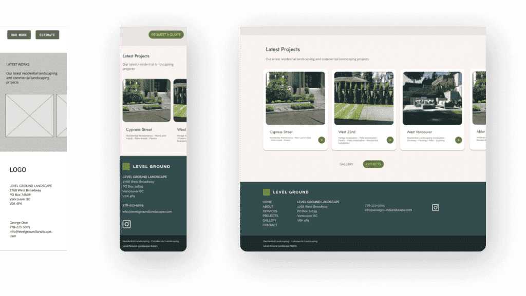
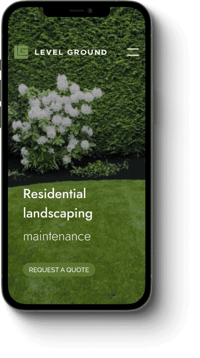
Responsive design using standardized components and clear CTA
Focus on design and layout with a balance between image and text
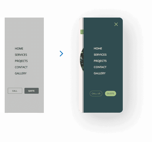
Simple navigation
I made sure all of the initial challenges were met
1. What colours, fonts and page layout will speak more directly to the target audience.
Result: New colours and fonts, chosen based on user research. More negative space and balance between image and text.
Average session duration +57%, Bounce rate -7%
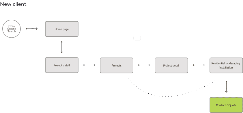
2. Simplified access to latest projects from all pages
Result: Clients can get to the most current projects from many paths.
Doing a deep dive into the comparative analysis allowed us to discover opportunities to reposition the brand with more focus on the residential portion of their services. User interviews informed how we connected the target audience with the redesigned user interface and content.