the butcher app

local + organic

UX Research – UX Design

the butcher app

local + organic

UX Research
UX Design

Project

The butcher app (Google UX case study project) was developed for a family owned specialty butcher shop in Saint Louis, MO.

The butcher wants to make it easier for their customers to place orders online during the pandemic.

Challenges

  • Before launch determine if ordering and pickup is easy for users
  • Shopping cart user flow and UI
  • Easy navigation
DATE

May 2021 – Oct 2021

role

UX Research
UX Design

research

Competitive audit
User interviews
Moderated usability study
Empathy maps
Personas
Journey maps

deliverables

App UI
Design system

Empathize

My goal was to to figure out if users can complete core tasks, ordering butcher products for pick up or delivery, within the app.

  • How long does it take users to find products and place an order
  • What can we learn from the steps a user takes in the ordering process
  • Are there any parts where the user is getting stuck

The personas

persona - 1Mark

Age: 21
Education: BA (in progress)
Hometown: St-Louis
Family: Single
Occupation: Student

Mark is a student on a budget who needs to save money on his butcher order because he is saving money to move to NYC after finishing school.

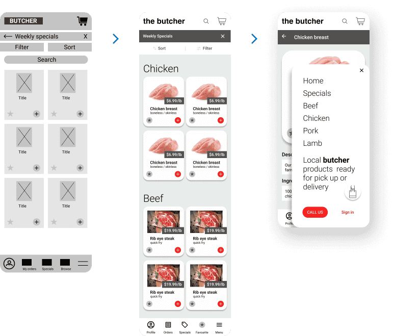
“As a student on a budget, I want to know the weekly specials, so that I can save money on my butcher order.”

persona - 2Anna

Age: 45
Education: BCL/JD
Hometown: St-Louis
Family: 2 dogs
Occupation: Lawyer

Anna is a busy professional who needs a reliable way to order her butcher products online because she has limited time to wait around.

“As a busy professional, I want a notification when my order is ready so that I do not wait.”

Competitive audit

2 direct, 3 indirect 

I compared the user experience of competitors website / mobile website and app. The key competitors are the butcher shops: Kenrick’s and Don’s Meat Market. Our indirect competitors are grocery stores, Schnuck’s and Straubs.

While many of the competitors have similar offerings, I see the following opportunities:

  • Have all items available to order online
  • Have a way to ‘save’ orders for quick ordering
  • Have some vegan options for those who do not eat meat
  • Allow for scheduled pick up / delivery
  • Notifications when order is ready for pickup
  • options to save (buy one get one, friend referral, recipe deal, student discount, daily special)
  • Multilingual (future version)

Ideate

I constructed a journey map, user flows, and paper wireframes of how our personas might interact with the app. This helps understand how a user might travel thru the screens of the app and lets us think about the navigation and user interface with user goals in mind.

Paper wireframes

Digital wireframes

Prototype

After creating the prototype I ran a moderated usability study with 6 tasks. Problems arose for the users and were documented, themes were noted and our list of changes for the next version were set.

  • 3 out of 5 users want clear visual cues for booking delivery or pick up
  • Easier navigating (all items belong to categories)
  • Add favourite items

I wanted to make sure all of the initial challenges were met

1. I fixed steps in the ordering process that were challenging for users

Result: New versions of the shopping cart – pick up and delivery page, making selecting date and time clearer.

2. I made sure the user understood how to select quantities for items being sold by weight

Result: The product detail ‘add to cart’ button and text around quantities with weight made it clearer for the user.

3. I made sure the navigation was standardized and there were multiple routes to accomplish each task

Result: Using standardized patterns from material.io like the ‘hamburger’ icon and navigation drawer elements helped make the navigation more intuitive for users.

Style guide

Final design

Further details: Case study .pdf

Take aways

Checking in with users for feedback at each stage of the design process helped direct the next iteration of the designs. Each user had different issues, but it was interesting to explore the common themes in the user problems. The design revisions were focused on the common issues. The shopping cart process, especially the booking of delivery and pickup times, was a pain point that most users expressed that I hadn’t anticipated.